


4.5 out of 5

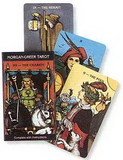
AzureGreen DPAGMIN Pagan Mini Deck
* Click "Add to Shopping List" to save the item for later purchase. You can receive a notice email when it is back in stock.
Pricing Note
Handling Fee Reminding: $3.00 handling fee will be charged for ALL items from the same series, product code beginning with EEW- if you order less than $70.00.
Product Description
Manufacturer Part Number: DPAGMIN
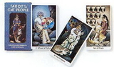
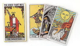
A valuable tool for the pagan on the go, this miniature version of the Pagan Tarot, often called the Pagan Mini blends traditional Wiccan and Pagan symbolism with modern lifestyles.
A valuable tool for the pagan on the go, this miniature version of the Pagan Tarot, often called the Pagan Mini blends traditional Wiccan and Pagan symbolism with modern lifestyles.
 Attention CA Residents: Prop 65 Warning
WARNING:
This product can expose you to chemicals which are known to the State of California to cause cancer, birth defects, or other reproductive harm. For more information, go to www.p65warnings.ca.gov.
Need more information?
Our staff are available to answer any questions you may have about this item
Our staff are available to answer any questions you may have about this item
Customer Reviews
By Boudica
Date: July 13, 2005
I was excited at the idea of a "pagan tarot". My thought was that this would be a very generic deck that would appeal to any pagan on any path. I should not have thought; it is not good for me to think. The deck comes with a tiny little booklet. The first line in the tiny little booklet reads: "This entirely new tarot deck is illustrated with scenes from the life of a modern pagan or Wiccan." Looking at the deck... more Wiccan than pagan I'd say.But, a closer examination suggests "Wiccanish" more than anything else. However, I get ahead of myself. Let's start with the look and feel of the deck.The reverse of the deck is the "World" card from the deck. Interresting. Shades of green. Subdued is the word that comes to mind. The deck is "hand size" making it easy to handle.The cards themselves are... bland. The color scheme might have been called "earth tones" except for the overuse of black, grey and sepia tone. No bold, bright colors here. Very little color at all. Sometimes a touch of a dull maroon. Or a dirty lavender. I hope this was not a printing error, and the deck I got was a mistake. The artwork itself is nicely drawn. The actual art is nice. Just wish it could have been a bit more "happier" in color and appeal. Our spiritual paths are happy, not sullen and monotone. Take a look at any pagan festival, the key word is color, no matter how loud or garish. We revel in color. We celebrate color. Yet, this artwork is colorless in my opinion, thus rendering the lovely artwork lifeless.The tiny little booklet explains how to read the deck:"Overall, you, the reader, are asked to look at each scene and ask yourself "What is happening here? What is s/he feeling here? How does this work with the other cards around it?" OK, so we look at the pictures and decide what the picture tells us and how it interplays with the various cards around it in the reading. Simple enough.The cards themselves have the name of the card and the card number at the top of the card. At the bottom the name is in four other languages. I get this: a universal feel to the deck. That's good.The first card is the Fool. It shows a person stumbling in the darkness, with stars, kind of a universal or space theme and there is a cat at her feet. The woman is wearing a robe. I thought this was interesting for the Fool and moved on. The Magician. Hmm... While all the parts/pieces are there, the Magician does not look very magical. Actually, he looks like he's not succeeding at his art at all. No magic there. Nothing magical going on, this person looks like he might be praying or something.Then there is the High Priestess. This one gave it all away to me. At first, it looked like the High Priestess was invoking the Goddess in a circle, but upon actually looking at the card, the group is not in circle, they appear to be just hanging about. The position of the High Priestess seems to be between the group and the Goddess. It gives more of a separation here, rather than the connection a High Priestess is supposed to give. If the Goddess form was above the High Priestess and the group was in circle around her, it would have been the correct Wiccan form. But this card seems to be saying that the High Priestess is the point between ourselves and the Goddess, rather than the point of connection between the Goddess and ourselves. Wait, the images up to now are all wearing robes. Nothing pagan here, but again very "Wiccanish". Like someone who was not familiar with Wiccan rites and beliefs had heard or read a few things and was drawing the images based on second hand knowledge. At least, that's how it appears. I moved to the next card.The Empress, traditionally the mother figure pregnant with the world, is broken into images of a child, a young girl and an older woman. That didn't seem to fit right. The Empress is a mother, not a crone, nor is she a young girl, but sometimes shown as a young woman. She is usually pregnant, not shown with a child. I got mixed feelings here.And the colors, so bland. This was getting monotonous. I skipped through the deck some more. The Lovers. What was this? Where is the usual young couple entwined with each other? Instead we have a young girl (?) looking at two paths, one with a person with a child and a house, the other with what appears to be a coven. What kind of lovers is this? Does she have to make a choice between family and religion? That doesn't make sense.Not all the cards were questionable in content. I liked The Hermit, as it suggested more learning and reflecting. Strength was an interesting concept, with a very earthy setting, a stronger green color than used in most of the other cards, and the animal totems around. At least, that's how it appeared to me.The Devil... hmmm. I'm afraid I didn't get that one at all. Some robed figures behind a sitting young lady, who is writing by a candle light, and has a sword. There are two ethereal figures, one male and one female, in front of her. The Tower, two couples, naked, passionately entwined with each other while a robed female who looks very dejected, walks away from the scene. I'm sure there is something suggested here, but I've always like the reference to the Tower being "House of falsehood", from the Rider-Waite explanation. I didn't get anything like that here, but what is suggested I didn't like.I skipped to the Lesser Archana cards. While swords is usually associated with Fire and Wands with air, the reverse is held in this deck. Swords are given air attributes, wands are associated with fire. I found myself referencing the tiny little booklet for these cards. Again, not very clear. I found myself fishing. The Court cards are changed a bit as well. The page is now the "Elemental" of the suite. So swords is a fairy, ok... that works. Wands is a fire lizard. Water is sprite. And earth is, oh my goodness, a leprechaun. What? That nasty looking creature is associated with Earth? Where did this come from? I'm sure they could have picked something more "earthy" in feel than a leprechaun. The knight, queen and king become Novice, Initiate and Elder. In cups and pentacles they are female, in wands and swords they are male. Balanced, in a way, if nothing more.To say I am disappointed with this deck is an understatement. To say I don't like it personally is to be honest. As a Wiccan Priestess, I have to say the images are overwrought, and do not address actual Wiccan practices or beliefs, but merely suggest from an outsiders point of view. As a Tarot reader, the images are strained, not suggestive of anything traditional, nor are they easily interpreted from the images presented. I also do not feel my clients would find the deck attractive. I certainly do not. It has to appeal to the client, or the client loses interest. As a pagan, it feels very specific to something "Wiccanish" rather than embracing the earth aspects and freedoms we hold dear. Overall, I would recommend you give this deck a good looking at before you decide to order it. Based on the name alone it may spark some interest, but I found it lacking in appeal and questionable in content. boudica
Rating:  [2 of 5 Stars!]
[2 of 5 Stars!]
Items 1 - 1 of 1 reviews
1